
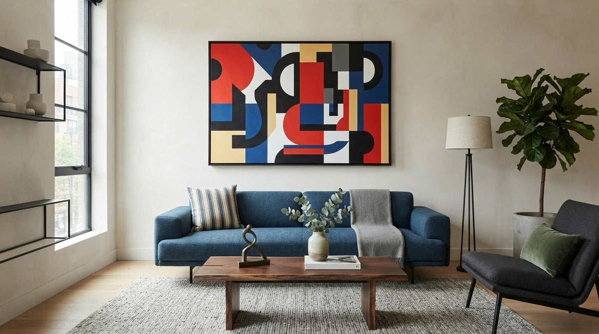
How to Choose Art That Complements Your Decor and Style
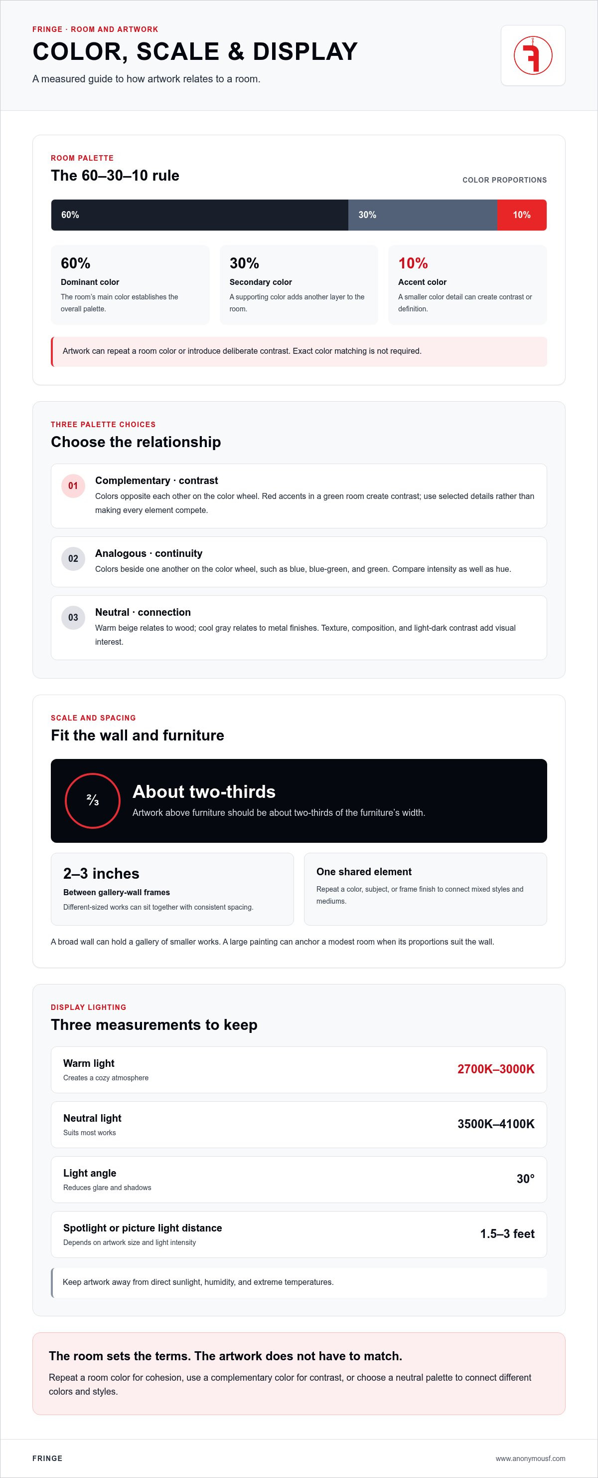
Exact color matching isn't necessary. To choose art that complements your decor, relate its colors to the room’s dominant, secondary, and accent colors, then decide whether the piece should harmonize or create contrast. The 60-30-10 rule gives those roles a simple framework: 60% dominant color, 30% secondary color, and 10% accent color.
A room’s palette is a starting point, not a rulebook. Blue furnishings can sit alongside orange accents in a print, while art with subtle color can give a neutral room definition without overwhelming it.
This guide explains how complementary, analogous, and neutral palettes work with a room’s theme, interior style, and scale. You’ll also learn how to weigh an artwork’s size, frame, and placement so the finished room feels considered rather than matched piece by piece.
Key Takeaways
- Assess the room’s layout, furnishings, and wall space before choosing a piece; above furniture, artwork should be about two-thirds of its width.
- Use the room’s interior style as a guide for subject, composition, and frame, rather than treating one style as a rule for the whole room.
- Choose between complementary colors for contrast, analogous colors for harmony, or a neutral palette for a quieter effect.
- Consider whether the artwork should blend into the room or become its focal point. The right choice depends on the role you want it to play.
1. Coordinating art with room themes and color schemes
Knowing how to choose art that complements your decor starts with the room itself. Assess its size, layout, and existing elements: note open wall space, furniture placement, floor color, and the room’s purpose. A living room arranged around a sofa has different focal points from a narrow hallway or a bedroom with a large headboard. These details help you choose suitable artwork, scale, and placement.
Match artwork to the furniture and available wall space. Above a sofa, choose a piece about two-thirds of its width; very small art can disappear above large furniture. A large painting can anchor a modest room when its proportions suit the wall. A gallery of smaller works can fill a broad wall without relying on one oversized focal point. Landscapes can reinforce rustic furniture, while abstract artwork can contrast with traditional elements.
Use the 60-30-10 rule to read a room’s palette: 60% dominant color, 30% secondary color, and 10% accent color. Art can repeat one of those colors or introduce deliberate contrast. In a blue room, orange accents create contrast; in a neutral space, a restrained color detail adds definition. Exact matching isn’t required.
With patterned wallpaper or textiles, identify the background color and a quieter motif, then select art that repeats one element. A simpler image can balance a busy pattern; matching every motif may crowd the room.
A practical way to decide how to choose art that complements your decor is to consider your budget alongside the room’s priorities. Set a spending limit and include framing; thrift stores and local art fairs offer more affordable options.
2. Matching artwork to interior design styles
Let the room’s furniture guide the artwork’s visual language. Abstract compositions and clean-lined prints suit contemporary spaces, while detailed frames pair naturally with traditional rooms. Black-and-white photography can echo industrial finishes; colorful, varied pieces add interest to bohemian living rooms. A bedroom or reading nook often benefits from landscapes or abstract work in soothing colors.
Mix styles, frames, and mediums through one shared element: repeat a color, subject, or frame finish across the display. For example, combine photographs and prints in different frame styles, then connect them with a consistent palette. A neutral mat or repeated frame color can keep the arrangement coherent without making every piece alike.
Color also shapes a room’s mood. Bold compositions and saturated colors bring energy to a living room, while softer hues support a quieter atmosphere in a bedroom. Before hanging wall art, try it in different locations; its relationship to the furniture and natural light can change its effect.
Protect artwork by keeping it away from direct sunlight, humidity, and extreme temperatures. For display lighting, warm light at 2700K-3000K creates a cozy atmosphere; neutral light at 3500K-4100K suits most works. Position art lights at a 30-degree angle to reduce glare and shadows. Spotlights and picture lights generally sit 1.5 to 3 feet from the artwork, depending on its size and the light’s intensity.
For a gallery wall, combine different-sized pieces while keeping frames 2-3 inches apart. A shared color or frame finish can unify mixed styles and mediums; the variation supplies the interest.
3. Using complementary, analogous, and neutral color palettes
Artwork can match a room’s colors or introduce contrast. Choose based on whether the piece should blend into its surroundings or draw the eye. To choose art that complements your decor, first identify the mood you want the room to hold, then select a palette that supports it.
Complementary colors sit opposite each other on the color wheel. They create contrast, as with red accents in a green room. Use this relationship in selected details rather than across every element. Smaller artwork can carry a concentrated accent; a larger, vibrant piece makes color more prominent. The contrast should give the eye somewhere to land, not make every object compete.
Analogous colors sit beside one another on the color wheel, such as blue, blue-green, and green. They create continuity between artwork and nearby furnishings. Compare intensity as well as hue: muted art with subdued furnishings keeps the effect restrained, while vivid colors add energy. This approach helps you choose art that complements your decor when you want visual connection without exact color matching.
Neutral artwork can connect pieces with different colors or styles. Relate warm beige to wood, or cool gray to metal finishes. Texture, composition, and contrasts between light and dark can keep a neutral work visually engaging.
Should artwork match or contrast with your decor? Either approach works. Repeat a room color for cohesion, or use its complementary color for contrast. Consider the art’s subject, too: an original work that reflects personal values can become a conversation starter, while a quieter piece can support the room’s visual balance.
Fringe: Collectable Toys
Fringe creates Collectable Toys featuring original characters, alongside bronze sculptures, oil paintings, and limited-edition prints. These forms offer different ways to relate art to a room: a print or painting occupies wall space, while a sculpture or collectible toy introduces a three-dimensional element.
Choose a collectible toy when the room can accommodate an object with character and presence beyond the wall. Its role differs from a print selected to connect with a color palette or fill a measured space. The right choice depends on what the room needs and what holds your attention.
Fringe’s work spans wall-based art, bronze sculpture, and collectible objects. Each makes a different claim on the room.
Let the Art Set the Next Direction
How to choose art that complements your decor depends on the work’s relationship to the room and your own reasons for choosing it. A room can guide your selection, but it doesn’t have to dictate the subject.
Fringe creates physical artworks in varied forms, including paintings, bronze sculptures, and collectible toys. Each brings a different kind of object into a living space.
Let the final choice be the work you want to keep looking at.
Frequently Asked Questions
How do you choose art that complements your home decor style?
Choose a work that shares one clear visual quality with the room, such as geometric shapes, soft edges, or a repeated material. Then let another feature differ. For example, a restrained room can accommodate a piece with an assertive subject, while a room full of antiques can take a contemporary image. This balance creates connection without making the artwork feel like another part of the furniture set.
How should art colors coordinate with a room's color palette?
Use a color already present in a small room detail, such as a cushion, book spine, or ceramic object, to connect the artwork with its surroundings. Compare the art and room in the same light, since daylight and lamps can change how colors appear. If the connection feels too exact, choose a work that shares the color’s warmth or coolness instead.
What size artwork works best for different wall sizes and furniture?
Measure the available wall area and the furniture below it, then consider the artwork’s full footprint, including its frame. A group of smaller pieces takes up the arrangement’s combined width and height, not just the dimensions of each work. Fine-art dimensions are usually written width by height, unlike television measurements, which use the diagonal.
How do you arrange a gallery wall and space the artwork?
Plan the arrangement before hanging anything. Place the pieces on the floor or make paper templates, then adjust their positions until the group feels balanced against the wall and nearby furniture. Start with the work that should draw attention, and arrange supporting pieces around it. Check the overall outer shape as well as the gaps between individual frames.
What types of artwork work best in small, dark, or brightly colored rooms?
In a small room, choose artwork whose scale leaves enough visual space around nearby furniture; a single work can anchor the room if its proportions suit the wall. In a dark room, consider how the image’s light and dark areas read against the wall. In a brightly colored room, art with a quieter composition can provide visual rest.

Article by
Fringe

Read more
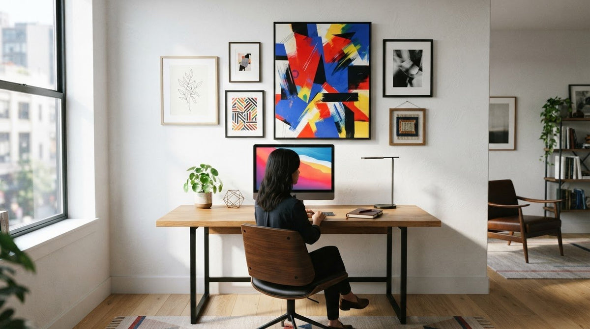
Choosing Art for Your Home Office: Wall or Gallery
Artwork for a home office should suit the available wall space and the atmosphere you want to create. Choosing art for your home office means deciding whether a statement piece or a gallery wall wo...
Read more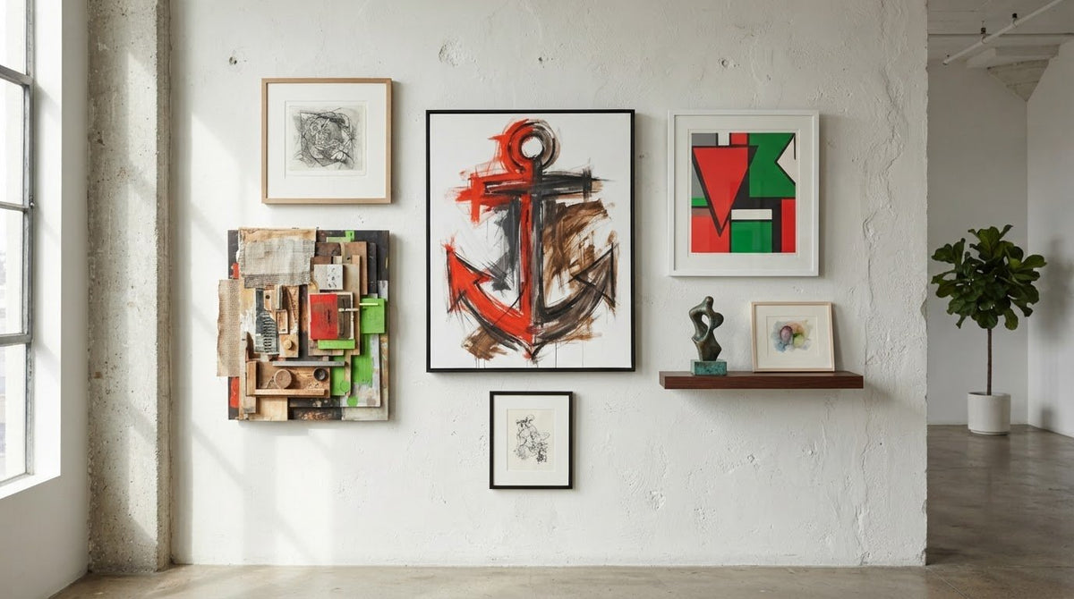
Creating a Gallery Wall with Mixed Media Art
Different materials do not make a gallery wall incoherent. Unplanned relationships do. Creating a gallery wall with mixed media art means deciding how scale, spacing, surface, and image relate befo...
Read more
Leave a comment
This site is protected by hCaptcha and the hCaptcha Privacy Policy and Terms of Service apply.